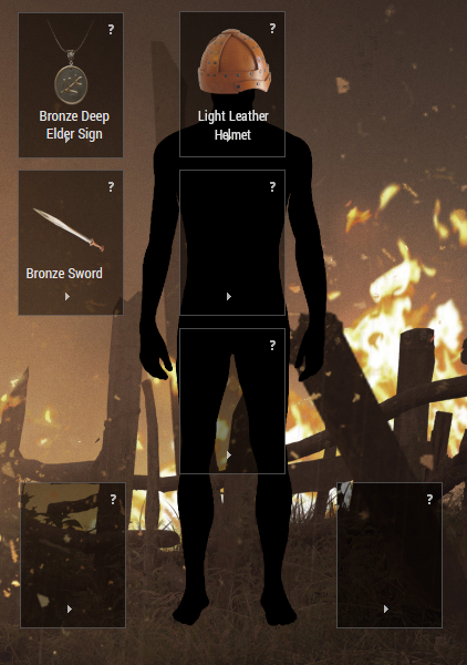
This week we revised our UI. While filming our first video, I realized that the display screen for equipment and materials is too heavy. I think we were just trying to get too much information out there, so instead we divided things into three different zones.
The new interface is more intuitive and consists of three parts:
- Inventory and disassembly
- Materials and crafting
- Blueprint and research

For detailed information about a character, I’ve added a whole new “character sheet” screen. This is still very much a WIP, but this screenshot should give you a pretty idea of where it’s headed.

That's it for this week. Have a great weekend!